
Introduction
Responsive Web Development Techniques have become a core skill for anyone building modern websites. Today, people browse the internet using phones, tablets, laptops, desktops, smart TVs, and even car screens. Because of this wide variety of devices, a website must look good and work properly on all screen sizes. This is exactly where responsive web development techniques play a vital role.
In the past, developers often created separate websites for mobile and desktop users. However, that approach was expensive, time-consuming, and hard to maintain. Responsive design solved this problem by allowing a single website to adapt automatically to different screen sizes and devices. As a result, businesses can now reach more users with less effort.
What is Responsive Web Development Techniques?
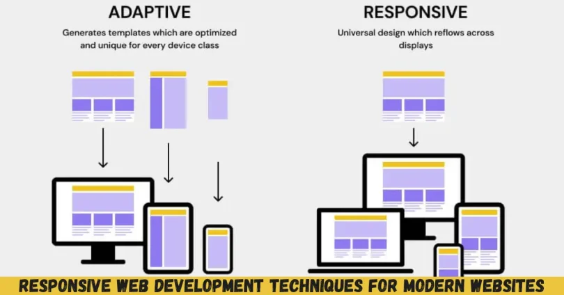
Responsive web development techniques refer to methods used to design and build websites that automatically adjust to different screen sizes, orientations, and devices. Instead of creating fixed layouts, responsive design allows content to flow smoothly based on available screen space.
These techniques rely on flexible grids, fluid images, and media queries. Together, they help a website respond to the user’s device without breaking the layout or reducing usability. For example, a three-column desktop layout may change into a single-column layout on a smartphone.
Responsive web development techniques focus on user experience. Text remains readable without zooming, buttons stay easy to tap, and images resize correctly. The goal is to deliver the same content and functionality, regardless of screen size.
Modern responsive development also considers performance, accessibility, and touch interactions. It is not only about resizing elements but also about adapting navigation, spacing, and interactions for different devices.
In simple terms, responsive web development techniques ensure that one website works everywhere.
Why is Responsive Web Development Techniques Important?

Responsive web development techniques are important because user behavior has changed dramatically. Most people now access websites using mobile devices, and search engines prioritize mobile-friendly websites.
First, responsive websites improve user experience. When users can easily read content and navigate pages, they stay longer and engage more. This reduces bounce rates and increases conversions.
Second, responsive web development techniques support better search engine rankings. Search engines favor websites that perform well on mobile devices. A responsive site helps meet these requirements naturally.
Third, maintaining one responsive website is more cost-effective than managing separate versions. Updates, fixes, and content changes only need to be done once.
Finally, responsive design prepares your website for future devices. New screen sizes appear every year, and responsive techniques help your site adapt without major redesigns.
In short, responsive web development techniques are essential for usability, visibility, and long-term success.
Detailed Step-by-Step Guide
Step 1: Use a Mobile-First Approach
Start designing for small screens first. This forces you to focus on essential content and features.
A mobile-first approach improves performance and clarity. Once the mobile layout works well, you can enhance it for larger screens.
Step 2: Create Flexible Grid Layouts
Avoid fixed-width layouts. Instead, use percentage-based widths or modern layout systems.
Flexible grids allow elements to resize smoothly. This ensures consistency across different screen sizes.
Step 3: Apply CSS Media Queries
Media queries are a core part of responsive web development techniques. They allow you to apply styles based on screen width, height, or orientation.
For example, you can change font sizes, layout structure, or navigation style at specific breakpoints.
Step 4: Make Images and Media Responsive
Images should scale within their containers. Use flexible image settings so images never overflow the screen.
Videos should also adapt to different devices without distortion or cropping issues.
Step 5: Use Responsive Typography
Text readability is critical. Use relative units instead of fixed sizes for fonts.
Line spacing and font scaling should adjust naturally across devices to maintain comfort.
Step 6: Optimize Navigation for All Devices
Menus should work well on both touch and mouse-based devices.
On smaller screens, consider collapsible menus that save space while remaining accessible.
Step 7: Test on Multiple Devices
Testing is a key step in responsive web development techniques. Use real devices and browser tools.
This helps identify layout issues, performance problems, and usability concerns early.
Step 8: Improve Performance
Responsive websites should load quickly. Optimize images, reduce unnecessary scripts, and keep styles efficient.
Performance directly affects user satisfaction and search rankings.
Benefits of Responsive Web Development Techniques
- Improved user experience across all devices
- Better search engine visibility and rankings
- Lower development and maintenance costs
- Consistent branding and content delivery
- Higher engagement and conversion rates
- Future-ready design for new devices
Disadvantages / Risks
- Initial learning curve for beginners
- Requires careful planning and testing
- Performance issues if not optimized properly
- Complex layouts may need extra adjustments
Common Mistakes to Avoid
Many developers misuse responsive web development techniques by relying only on screen size. Responsiveness is about user experience, not just layout changes.
Another mistake is ignoring performance. Large images and heavy scripts can ruin mobile usability.
Using too many breakpoints can also complicate maintenance. Keep breakpoints meaningful and manageable.
Finally, failing to test on real devices often leads to unexpected problems. Always test thoroughly.
FAQs
What are responsive web development techniques?
Responsive web development techniques are methods used to create websites that adapt smoothly to different devices and screen sizes while maintaining usability and design quality.
Do I need separate mobile and desktop websites?
No, responsive web development techniques allow one website to serve all devices efficiently, reducing cost and maintenance effort.
Are responsive websites slower?
Not necessarily. When optimized correctly, responsive websites can load quickly and perform well on all devices.
How many breakpoints should I use?
There is no fixed number. Use breakpoints based on content needs rather than specific devices.
Is responsive design good for SEO?
Yes, responsive web development techniques improve mobile usability, which positively impacts search engine rankings.
Can beginners learn responsive design easily?
Yes, with step-by-step practice and understanding of basics, beginners can learn responsive web development techniques effectively.
Expert Tips & Bonus Points
Focus on content first, then layout. This ensures clarity on all screens.
Use modern layout tools wisely and keep code clean.
Always think from the user’s perspective when designing interactions.
Document your breakpoints and design decisions for easier maintenance.
Regularly review analytics to understand how users access your site.
Conclusion
Responsive web development techniques are no longer optional in today’s digital landscape. They are a fundamental requirement for creating websites that meet user expectations and industry standards. With the growing variety of devices, a responsive approach ensures that your website remains accessible, readable, and functional everywhere.
By using flexible layouts, responsive media, and smart navigation, you can create experiences that feel natural on any screen. These techniques also reduce long-term costs and simplify maintenance, making them a smart investment for businesses and individuals alike.


